 |
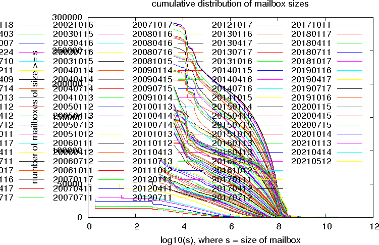
This plot shows the cumulative distribution of mailbox sizes on
the UTORmail system. The x axis is the size of the mailbox in bytes,
on a logarithmic scale. The y axis is the number of mailboxes of that
size or greater.
The curves rise with time because the total number of mailboxes increase with time. Compare with the UTORmail accounts plot. The method of calculating the mailbox size changed on 19990514. Before, only the INBOX was counted, and the size was the number of bytes in the INBOX. After, all folders were summed, and the size was the number of blocks (kilobytes) allocated The default INBOX format changed in Sep 2003 from UNIX format to MBX format, resulting in bigger small INBOXes. |
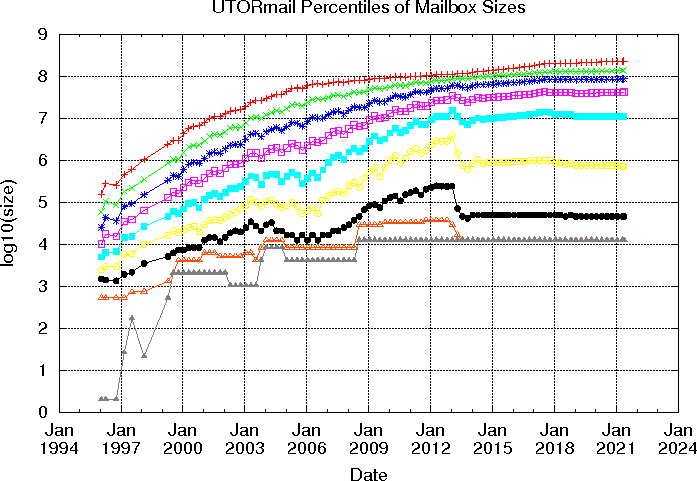 |
Here are the 10,20,...90 percentiles (deciles) of mailbox size plotted
on a logarithmic scale vs time. For example, the bottom line represents
the 10th percentile - 10 percent of the mailboxes are this size or
smaller. The middle line, the 50th percentile, is also the median:
half the mailboxes are this size or smaller.
Notes:
|
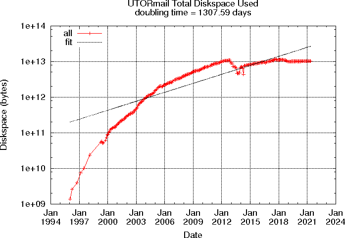 |
Here is the total diskspace used vs time plotted logarithmically.
The 'fit' is a least-squares fit of a straight line to the 'all' data (log(all) vs time), ignoring the data before Jan 2000. The "doubling time" is estimated from this fit. |